
“I hope people can’t tell right away that I’m using a wheelchair.” This feeling, expressed by over 60% of participants in a Baichen user survey, points to a widespread but often unspoken discomfort. Although electric wheelchairs have greatly improved in function, public perceptions of how they look remain stuck in the past: clinical white tubing, bulky frames, and a cold, utilitarian appearance. These visual cues unconsciously brand users as “sick” or “weak.” Baichen believes that tackling this aesthetic bias requires more than just better technology—it demands a complete reimagining of what a wheelchair should look like.
The Real Cost of Appearance Bias: Users Try to Stay Inconspicuous
A qualitative study conducted by Baichen’s user experience lab revealed:
Many users admitted they sometimes choose a manual wheelchair or a cane—seen as “less medical”—over an electric model for social events such as class reunions, work meetings, or dates.
Some users said they would avoid eating out or going shopping simply because their wheelchair’s color was “too hospital‑white.”
More than 80% of younger users (under 35) expressed a strong desire for customizable designs, or at least a wider range of colors beyond black, white, and silver.
One 32‑year‑old living with multiple sclerosis shared: “Whenever I rolled my silver‑gray electric wheelchair into the elevator, neighbors would look at me with pity and ask, ‘Off to the hospital again?’ I was just getting coffee. Eventually, I preferred to walk slowly on my own rather than face those stares.”
This is a textbook example of “stereotype threat.” When a wheelchair visually screams “patient,” users internalize that negative label and withdraw from public life.
Where Does the Bias Come From? The Dehumanizing Tradition of Medical Design
Conventional wheelchairs have been designed almost exclusively from a medical perspective: white or light gray symbolizes “cleanliness,” exposed metal tubing conveys “strength,” and oversize seats with heavy frames suggest “stability.” None of these features are inherently wrong, but together they produce a cold, functional aesthetic that overlooks the emotional and social needs of the user.
A deeper problem is that the industry has long classified wheelchairs as “rehabilitation aids” rather than “personal mobility devices.” The former frames the user as a patient; the latter recognizes them as an individual with personal agency and style. Once a wheelchair is branded a “medical device,” its appearance inevitably carries an undertone of “abnormality.”
How Baichen Is Breaking the Mold
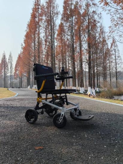
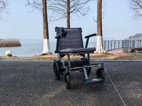
1. A Color Revolution: Saying Goodbye to “Medical White”
Baichen collaborated with color specialists to create the “Urban Explorer” palette, which includes Midnight Blue, Olive Green, Warm Sand Gray, Haze Pink, and Matte Black—shades borrowed from everyday fashion and home decor, not hospital corridors. Surveys found that after switching to a non‑medical color, users’ willingness to go out for the first time increased by more than 50%. One user told us, “My pink wheelchair got compliments from colleagues—now I actually enjoy rolling it through the office.”
2. Form Language: Clean Lines, Concealed Structure
Traditional wheelchairs resemble exposed skeletons. Baichen’s new carbon‑fiber series uses a single‑molded shell that hides most of the structural tubing. The overall profile looks more like a modern electric vehicle or a piece of high‑end luggage than a hospital bed. The battery and controller are integrated into the chassis, eliminating tangled wires and external hooks.
3. Interchangeable Panels: Let Users Personalize
On selected models, Baichen offers magnetic decorative panels that users can swap according to mood, season, or occasion. Materials include faux carbon fiber, cork, fabric, or even custom photo prints. This transforms the wheelchair from a fixed medical device into a canvas for personal expression.
An Industry Call: Design Equality Is Not an Extra
Globally, more than 130 million people use electric wheelchairs or scooters. Most of them face daily pressure from the way others look at them. One of the most effective ways to reduce that pressure lies in the product itself—if a wheelchair looks “ordinary,” “everyday,” or even “appealing,” it no longer attracts unwanted attention.
At Baichen, we believe that aesthetic design is never an afterthought. When a user feels more confident to go out simply because they love their wheelchair’s color, that is real social value.
We ask our industry peers: Could your next product offer an unconventional color? Could you hide a few more tubes? Could you ask users, “What style would you like?” instead of only “What width and height do you need?”
Baichen’s Commitment: The “Undesign” Initiative
Starting this year, Baichen will phase out “medical white” as a default color for all new models, offering at least six alternatives. We have also launched an online “Wheelchair Customizer” where users can preview different colors, decals, and panel designs before placing an order.
We believe that the day a wheelchair no longer “looks like a wheelchair” is the day prejudice truly begins to fade.
Visit the Baichen official website to try the customizer or share your story. Every choice you make challenges an outdated stereotype.
Ningbo Baichen medical Devices Co.,LTD.,
+86-18058580651
Service09@baichen.ltd
www.bcwheelchair.com
Post time: May-30-2026